
Objective
The goal of this project was to develop unique branding and concepts to create a functional aesthetic in a given environment experience. The project required design solutions that intersect with physical space while connecting with, and appealing to the target audience.
The project required the creation of a brand guide, which would then be implemented on the event environment. The environment included a pop-up store, two kiosks, and a banner pole.
My Approach
I created a female-centered pop-up bar for my physical environment. I wanted it to reflect fun, casual nightlife with the target audience being women between the ages of 21 to 45. When going out, women often have to be cautious because, unfortunately, it is not uncommon for them to encounter harassment. I wanted a bar where women and female presenting audiences could prioritize entertainment and positive experiences.
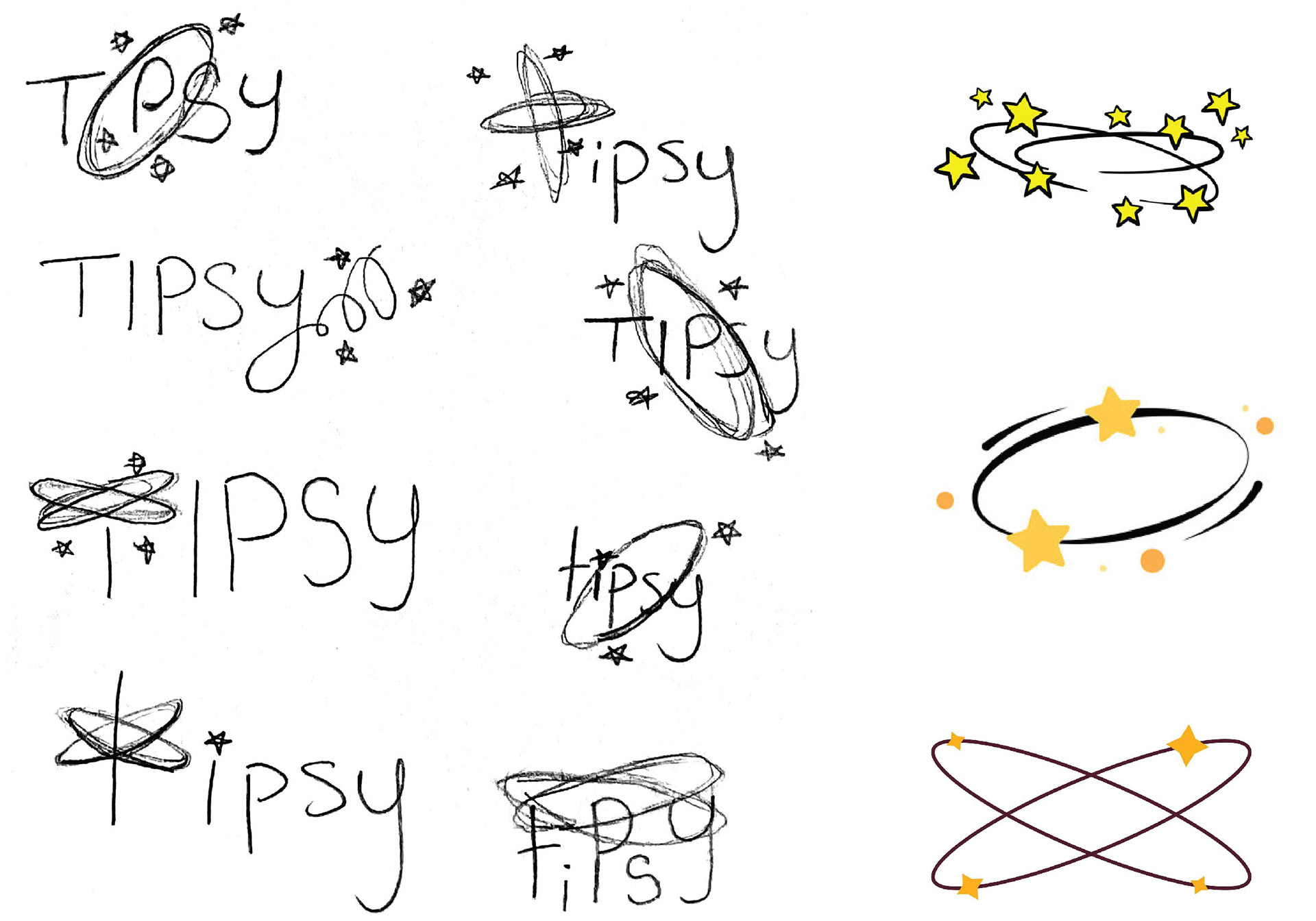
Logo Sketches & Inspiration
I wanted a fun name to reflect the vibe of the bar, and eventually landed on the name Tipsy.
I was inspired by the rings that form over the heads of cartoon characters when they're dizzy, and explored different ways to incorporate it into the logo.
Logo Development
While developing the logo, I explored a lot with type, weight, and the placement of the rings. Eventually I landed on the rings going around a lowercase 't'.
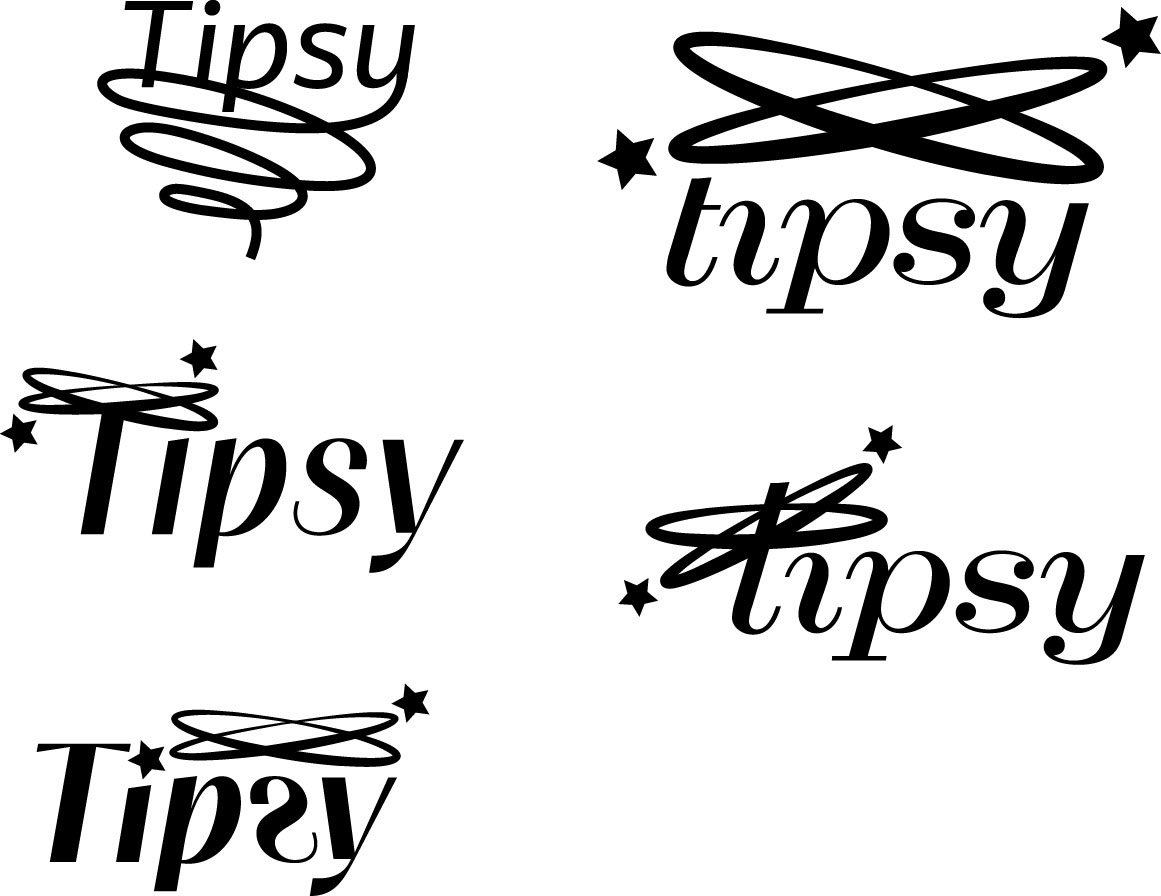
Final Logo
I chose Craw Modern URW italic for the logo as I was inspired to connect the 'T', 'I', and 'P' to create a continuous wavy line. I did this to emphasize the dizzy feeling. This later became inspiration for the pattern.
As for the stars, I used classic star and diamond shapes to give it a modern feeling. I strategically placed them around the rings so one of them could become the dot on the 'I'.
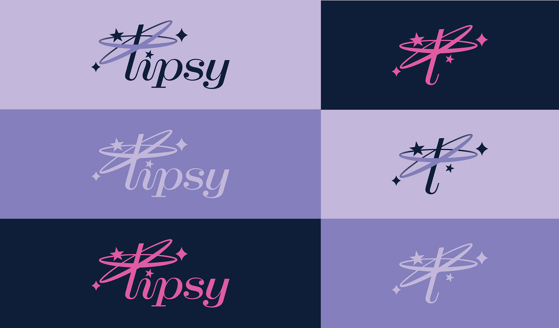
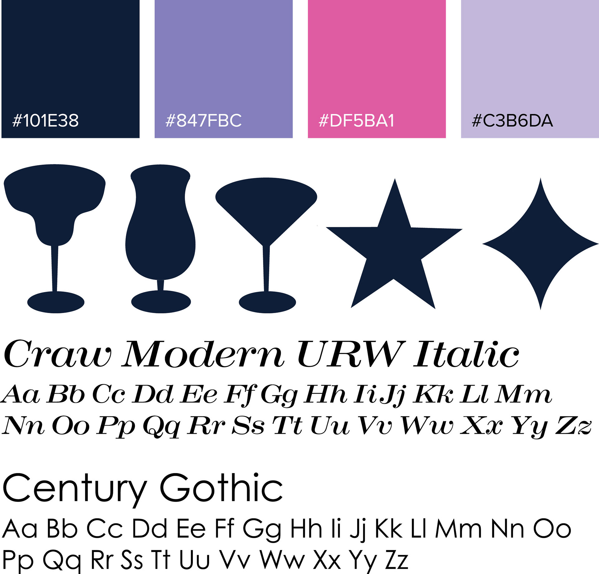
Colors, Icons, Type, & Pattern
For the colors, the pink was inspired by neon signs. The dark blue and purples were inspired by nightlife.
I used Craw Modern URW italic for its casual and fun characteristics. I needed a simple secondary type that wouldn't clash with the logo, so I paired it with Century Gothic.
The icons are silhouettes of common cocktail glasses, and the star and diamond are taken from the logo.
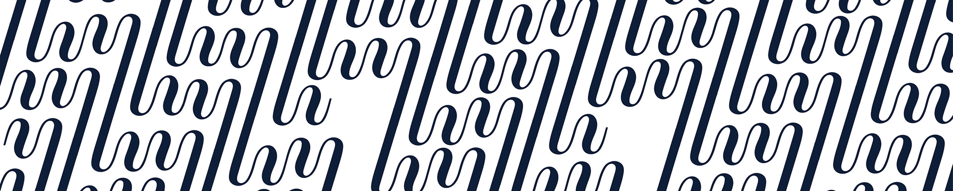
The pattern was taken from the 'tip' in the logo and modified to connect together continuously.
Brand Guide
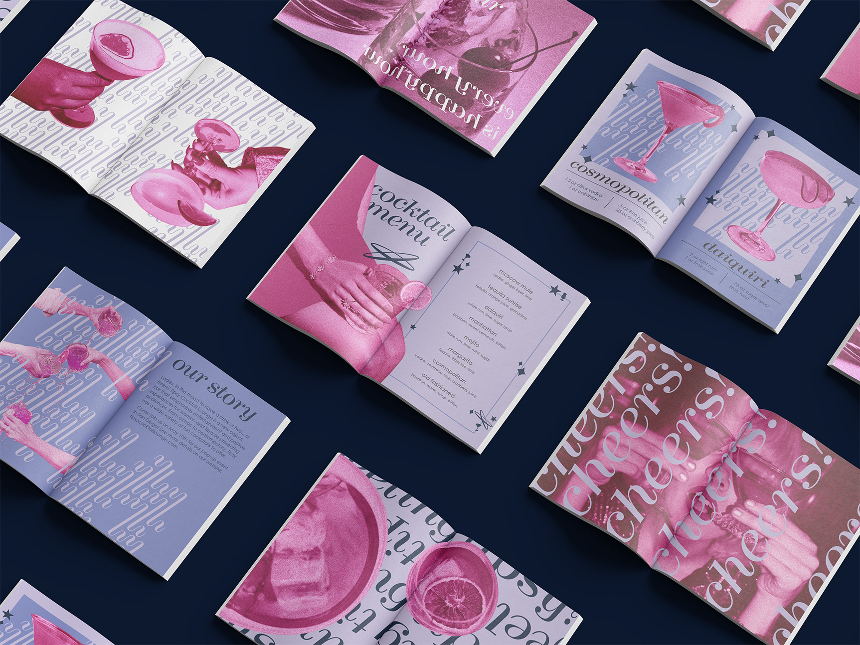
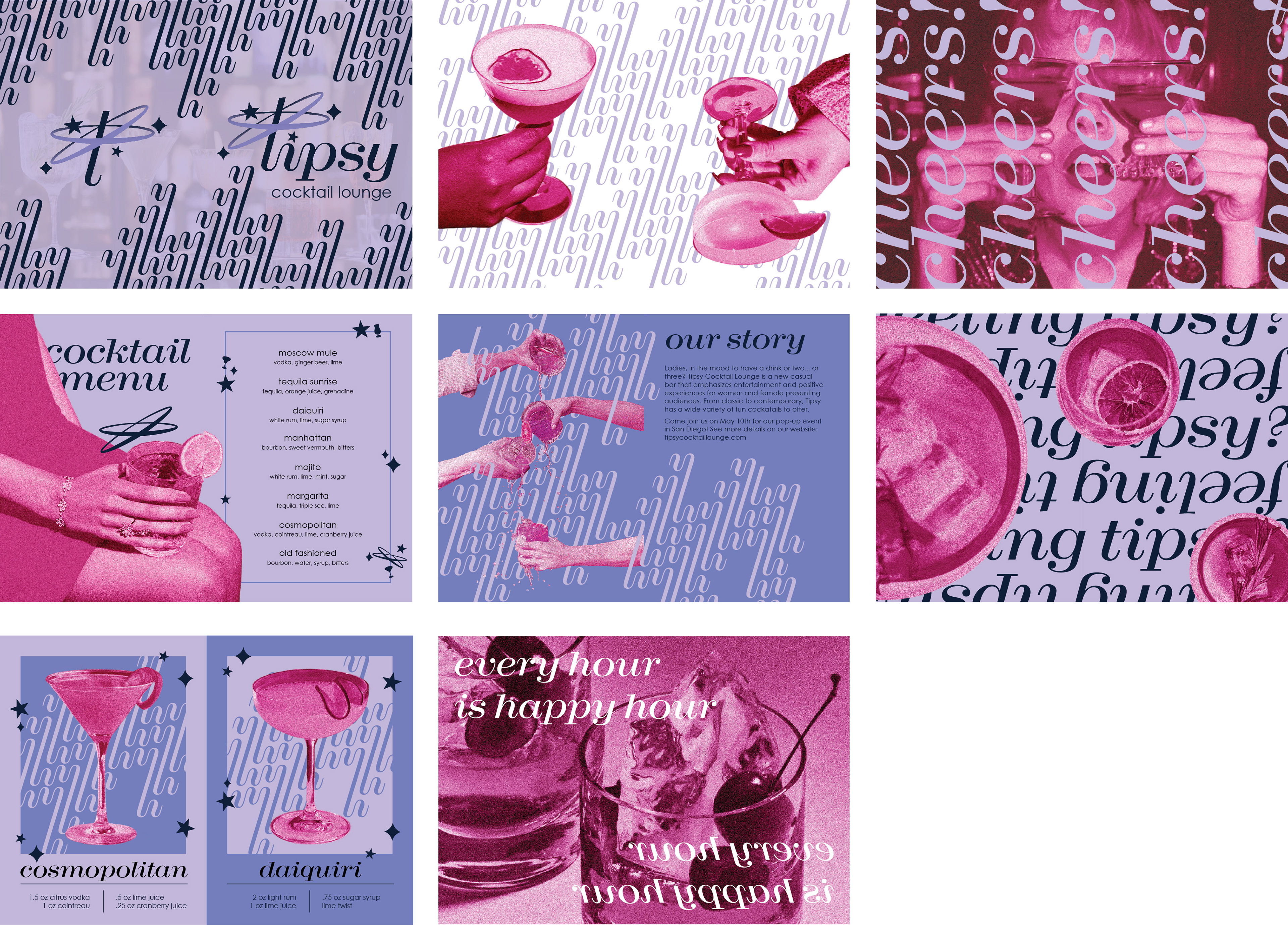
Before jumping into anything three dimensional, I created an eight page booklet to use as a brand guide. The booklet incorporated the brands colors, pattern, icons, type, and imagery in different ways. I also applied a grain to the imagery to mimic the warmth you get when drinking alcohol.
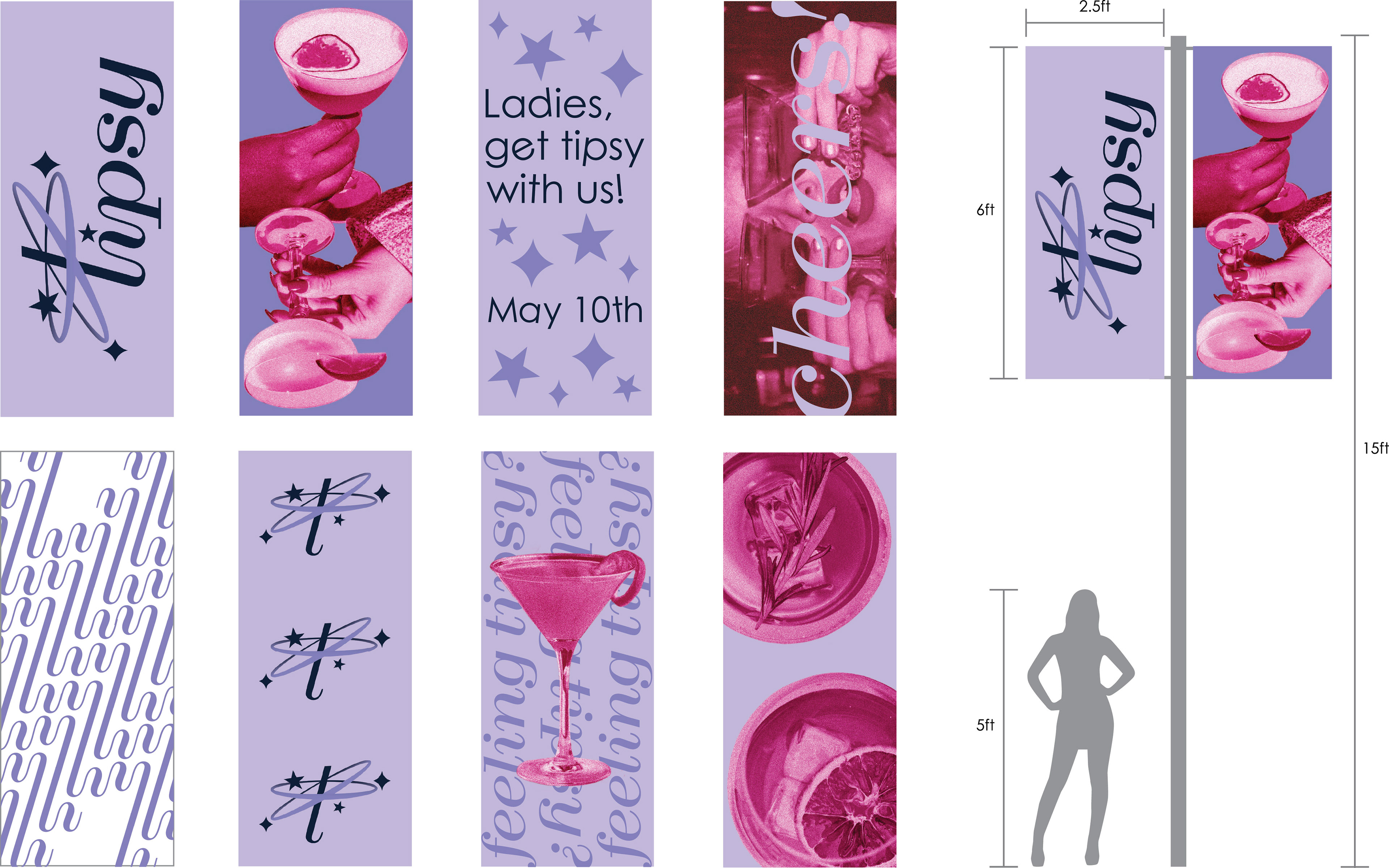
Banners
I translated different elements of the brand guide into a set of banners to promote the pop-up bar. I had to ensure each face on the banner pole paired well when looked at from different directions.

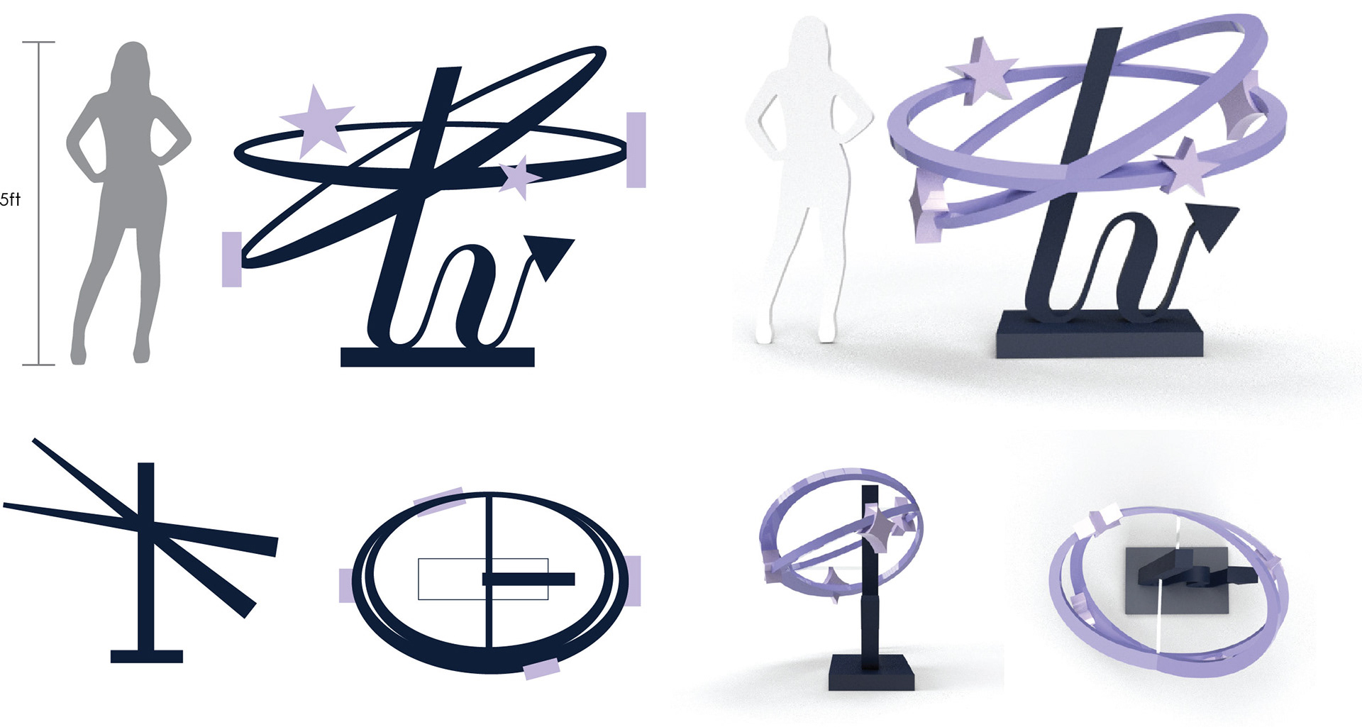
Kiosks
After getting a good grasp of the brand direction, I was ready to create the kiosks that would accompany the pop-up bar. The first one was a wayfinding kiosk based on the logomark. I made the rings three dimensional to go around the stem of the 't'. I had to adjust the width of the rings and the placement of the stars to make it accurate to the logomark when facing front. I then added an arrowhead to the end of the 't' to indicate the direction of the bar.
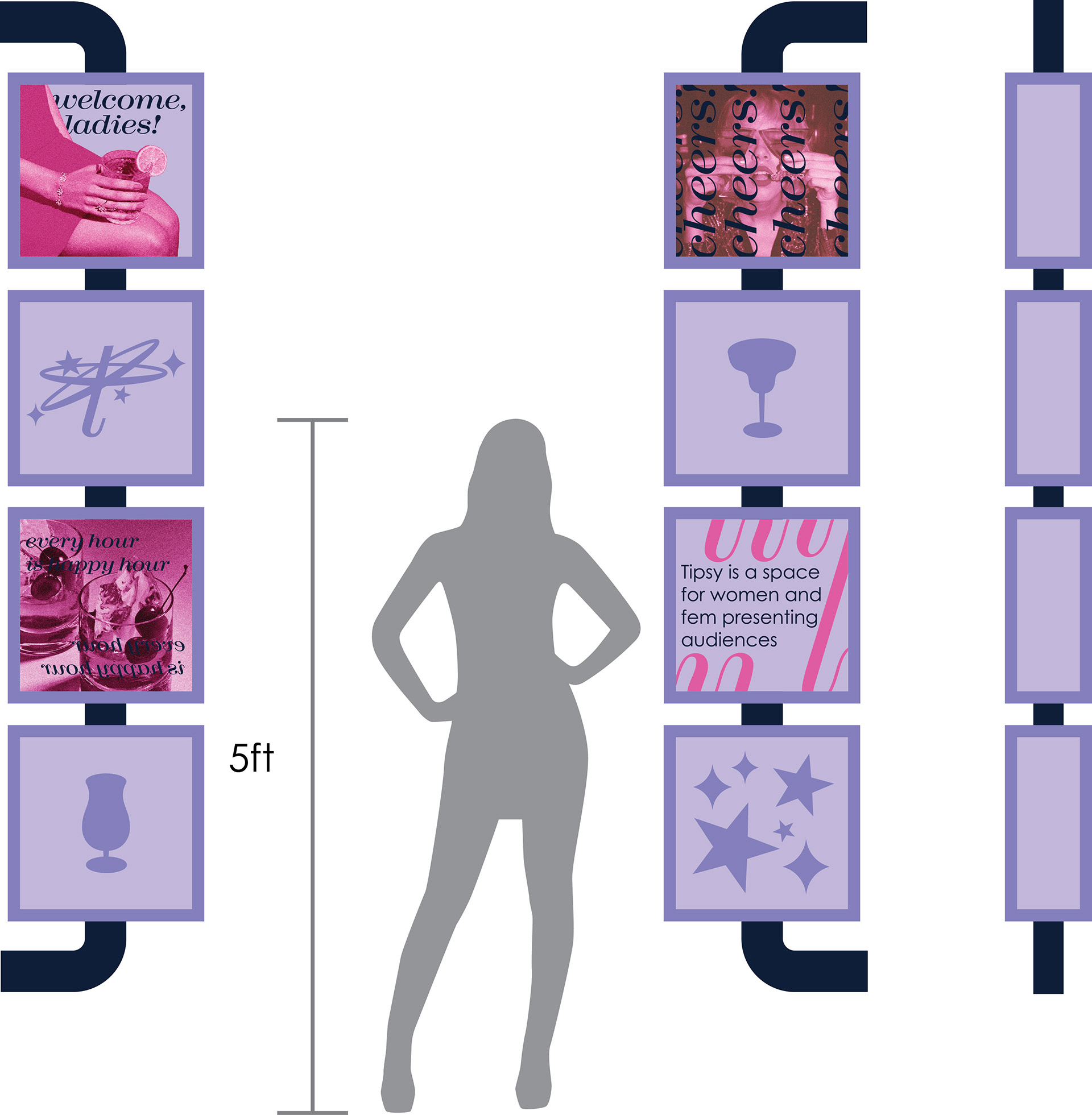
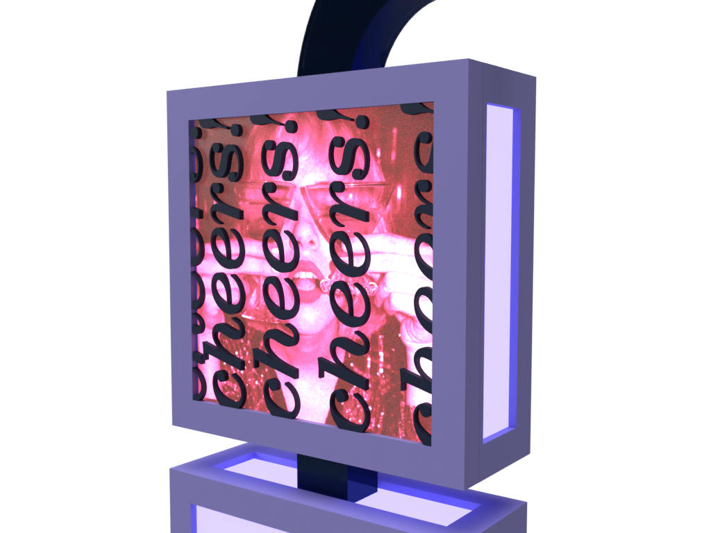
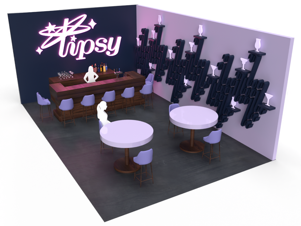
The other was a wall-mounted informational kiosk. I incorporated different elements from the brand guide to create neon signs. I wanted to emphasize that Tipsy was a bar that prioritizes positive experiences for women. I strategically placed it on the pop-up bar so people could see it from the inside and the outside.
Wayfinding Kiosk
Informational Kiosk


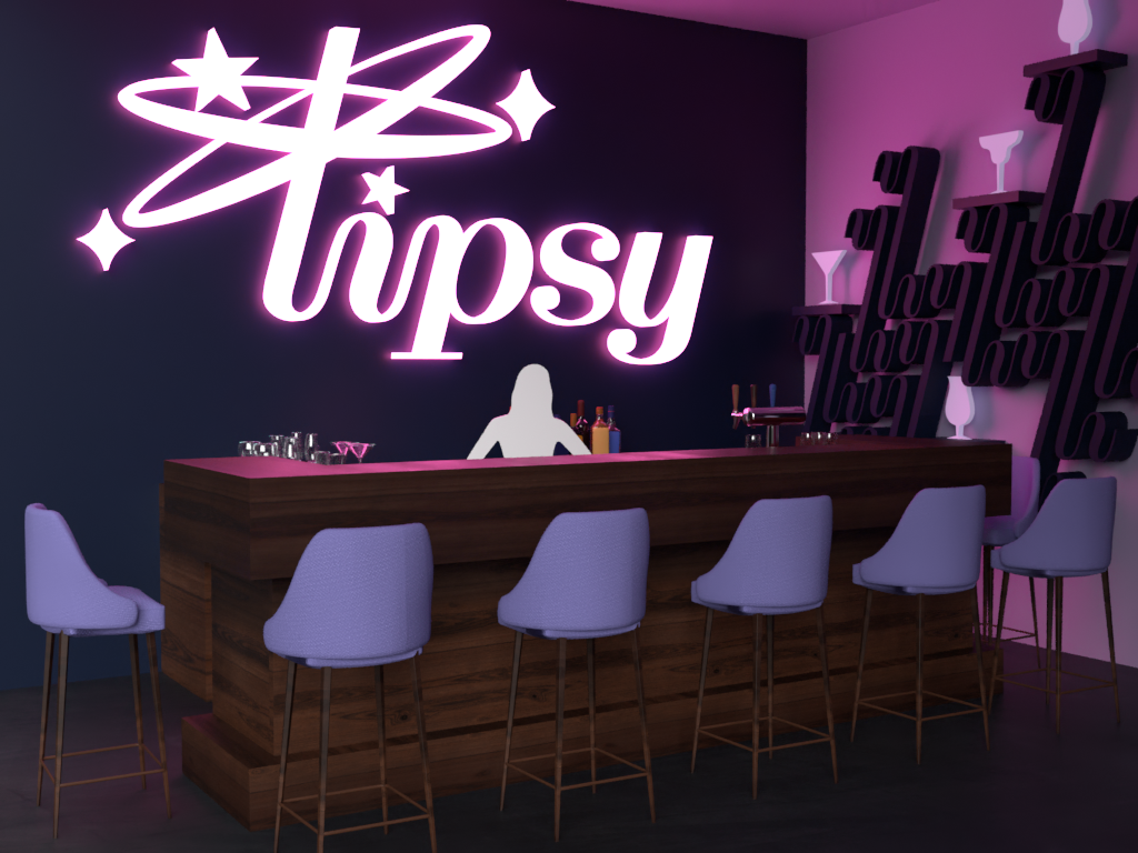
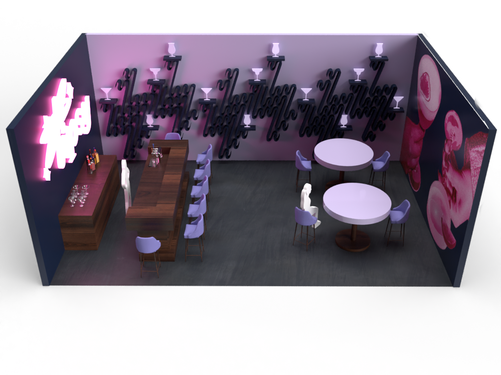
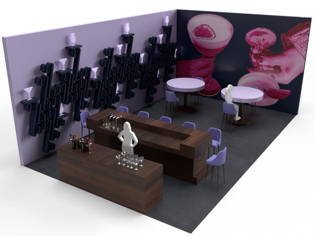
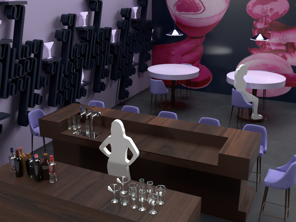
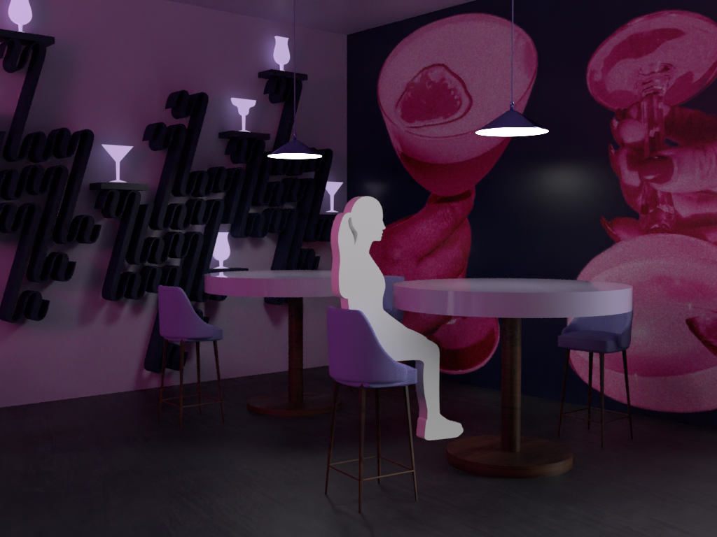
Pop-up Bar
After making the kiosks, I was ready to create the pop-up bar. To emphasize the nightlife theme, I gave the walls darker colors, and relied mostly on neon lighting to illuminate the bar. The graphics on the right wall were taken from the brand guide. The shelves were inspired by the brand pattern, and modified to allow space to place the cocktail glasses.
To give the room a more realistic look, I included a few different textures. The first is on the bar table, which is a dark chocolate wood. I chose this as it compliments the other colors and helps break up the room. Additionally, I included cocktail glasses, bottles, and a beer tap. The ceiling lamps are a shiny metallic and the table tops are a glossy enamel.


Laser Cut and Aero
The last part of this project was to create a better sense of realness to the brand and environment. To achieve this, I was tasked with creating a laser cut of the logo. This helps viewers understand what it would look like physically, and its capability to be used as signage among other things.
I was also tasked with creating a video using the program Aero. This video would help viewers visualize what it would be like to walk into the pop-up bar and see the kiosks and banners in real life.
