About San Diego Circuit
The San Diego Circuit is a specialized service designed to facilitate inter-library book borrowing among users across participating libraries within the San Diego Circuit network. This streamlined process enables patrons to efficiently access books from alternate Circuit libraries when the desired titles are unavailable at their home library.
While book borrowing is an essential service, the company wants to branch out and shift their focus on educating the community through public projects. They have already conducted multiple public awareness projects including topics such as Covid-19, climate change, reproductive health, and more.
Objective
While the San Diego Circuit is recognized for its innovative approach, its logo did not align with their ideals of working together to inform the community.
The primary objective was to develop a fresh visual identity, notably through the creation of a new logo. The client also requested collateral, which included a flyer, business card, landing page, and a pin.
The brand required an approachable, yet professional, tone to attract a wide audience. The client also requested to incorporate the geography found throughout the San Diego County.
Concept
I resonated with the idea of involving San Diego's diverse geography. It represents not just the land, but San Diego's diverse community as well. This calls back the client's mission to inform and educate the entire community.
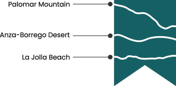
In order to represent the variety of San Diegan land, I focused my attention on topographic maps. I was inspired by the cross-sections used to understand these maps. I drew cross-sections from Palomar Mountain, Anza-Borrego Desert, and La Jolla Beach.
Sketches
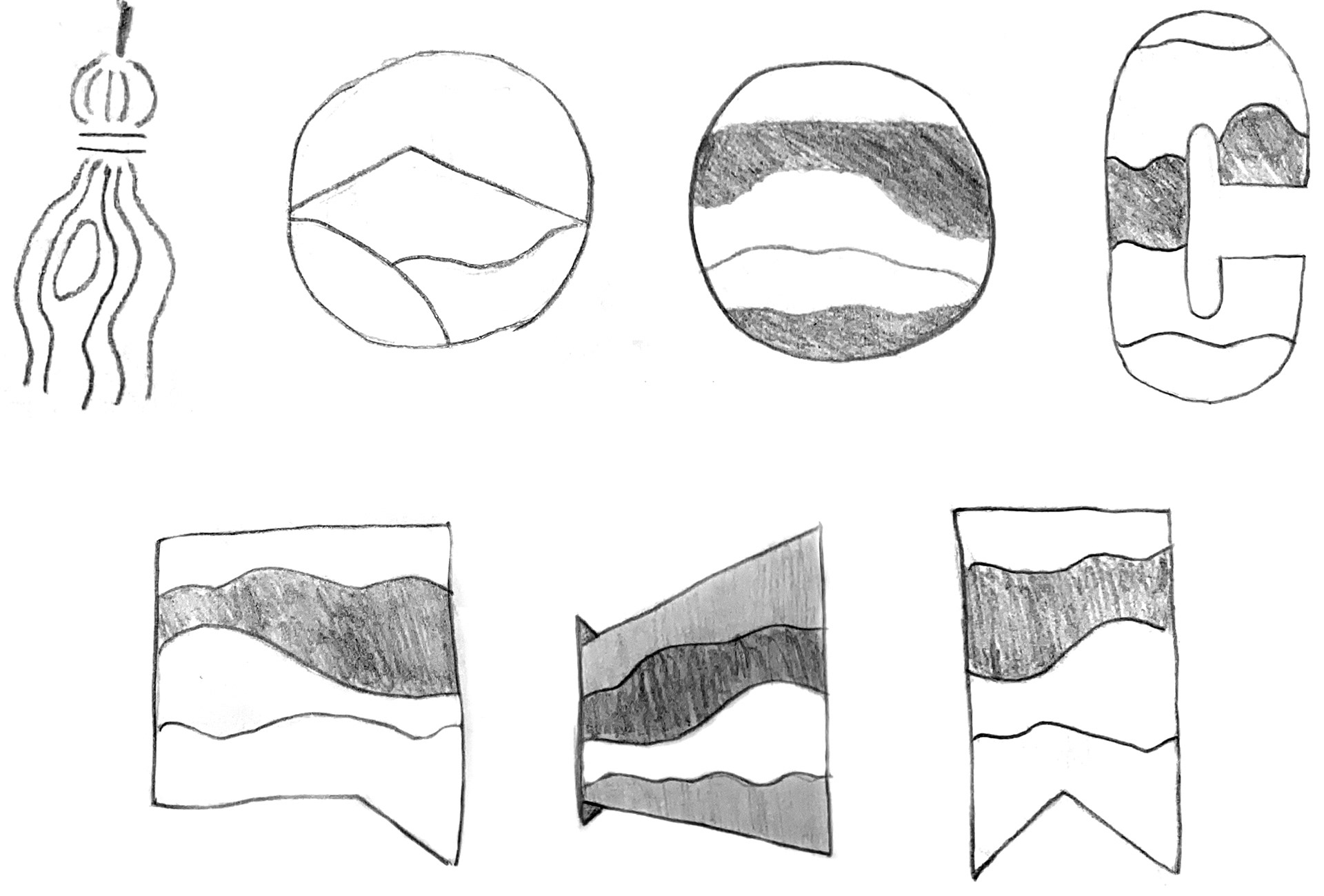
I explored different ways to incorporate multiple cross-sections while maintaining an educational tone.
Concept Development
I landed on using a bookmark as a container for the cross-sections. Initially, I wanted each section to be a distinct color, but realized it was too busy. Instead I made each section one color and used the negative space to make them distinct.
Final Concept
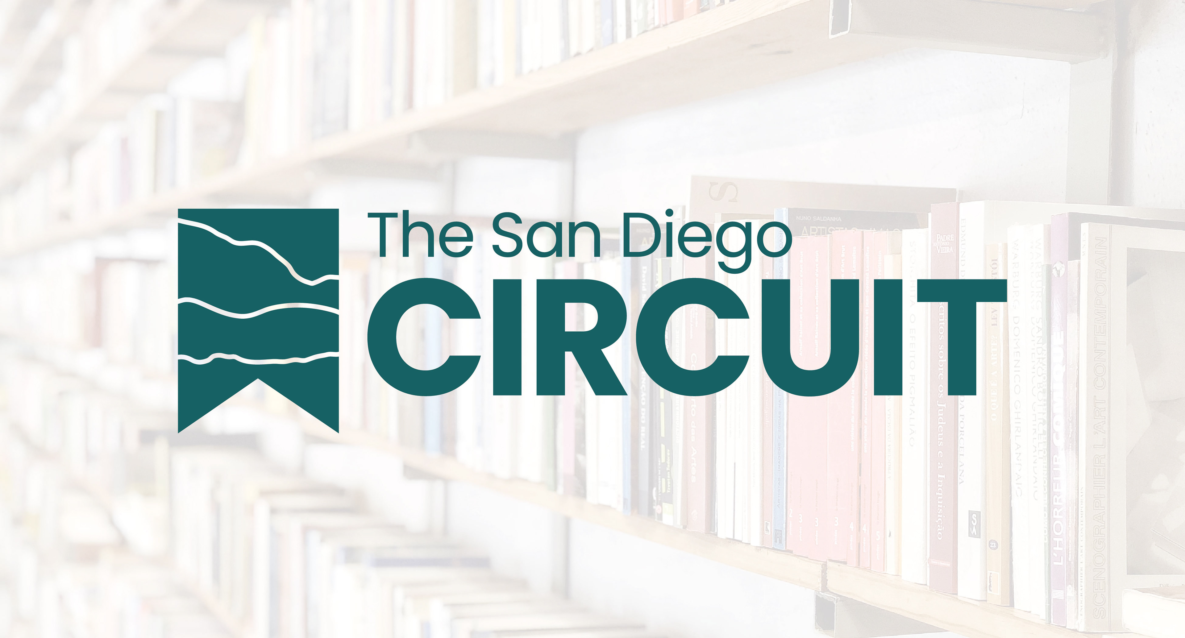
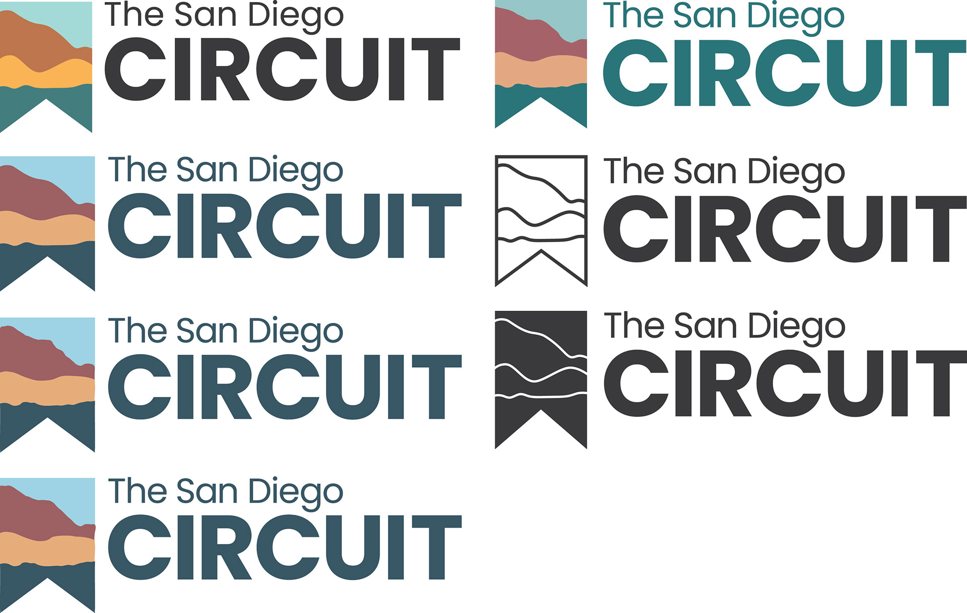
Because the type and image are separate entities, I decided to make them both the same color to ensure they feel connected as one logo. The primary logo includes “The San Diego” as per the client’s request. The secondary logo forgoes this element to allow for its use at smaller scales.
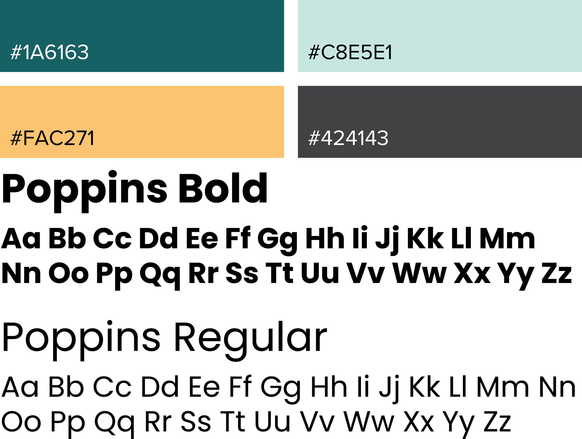
Color, Type, & Pattern
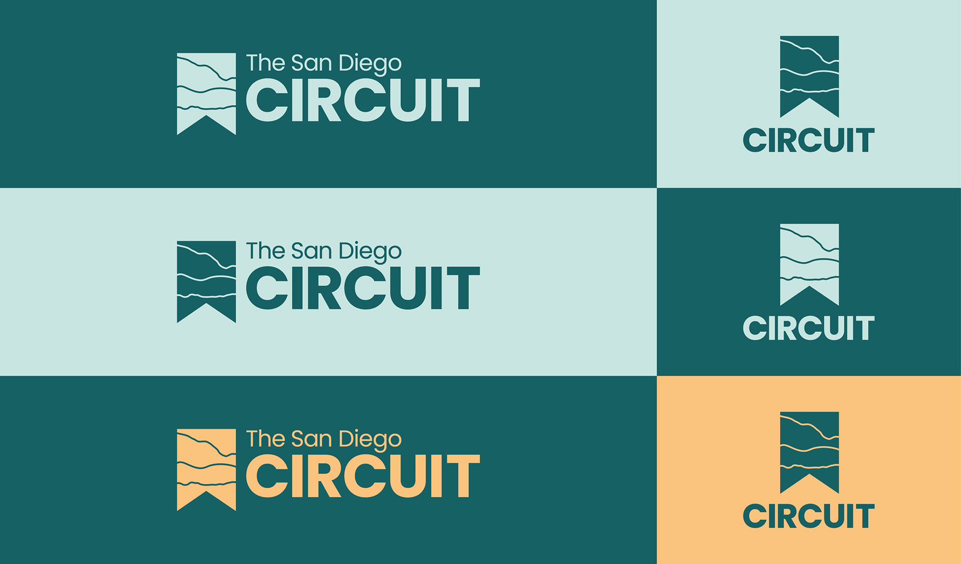
I chose a natural leaning color palette in order to compliment the geographical theme. For the primary color, I used a dark teal-green. Green represents nature, promotes calmness, and improves concentration, which are important to learning.
As for the type, I chose Poppins for its clean and round letters. This creates an inviting yet professional tone.
The pattern was inspired by the lines on topographic maps. I explored San Diegan maps and looked for the rings that form at the peak of hills and mountains. I then traced them and filled them with color rather than leave each ring as a stroke in order to better fit the brand style.

Collateral
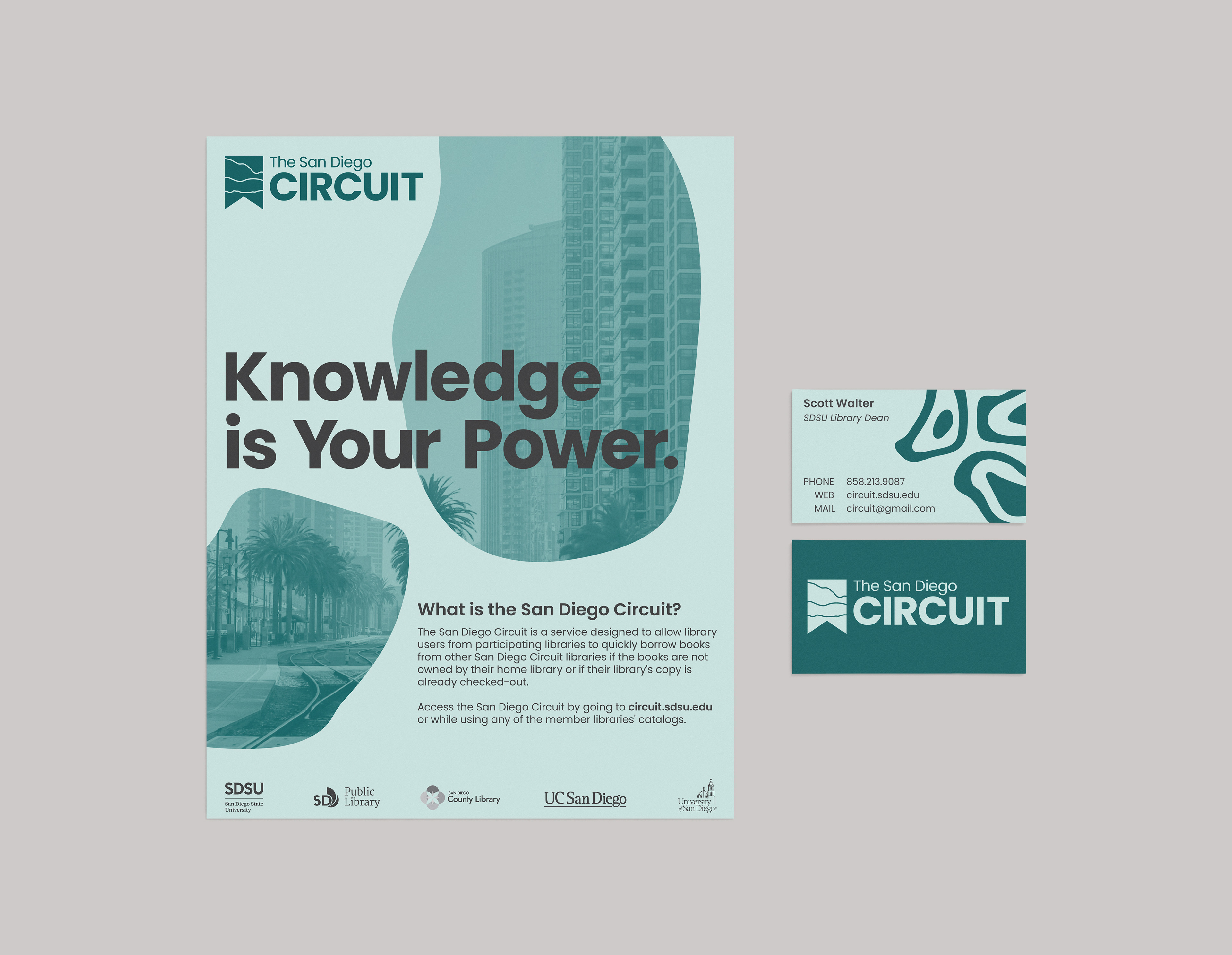
The client requested a variety of collateral including a flyer, business card (seen above), landing page, and a pin. The flyer uses the slogan "Knowledge is Your Power" as the focal point. The images of Downtown San Diego are strategically placed to draw the eye down to the other important information.
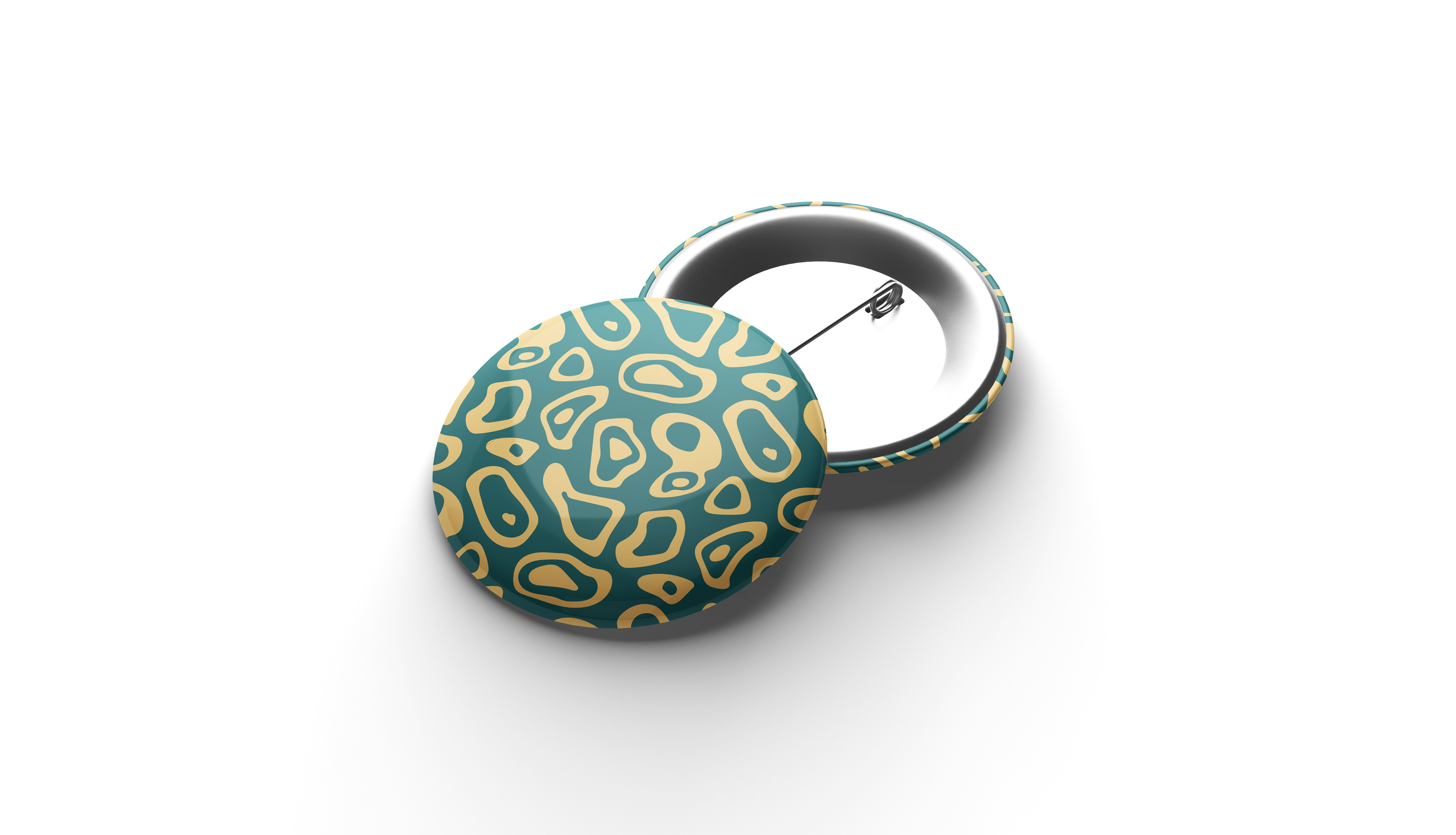
The business card is straightforward, using pieces of the pattern to decorate the front of the card. The pin also includes the pattern but in a different colorway.
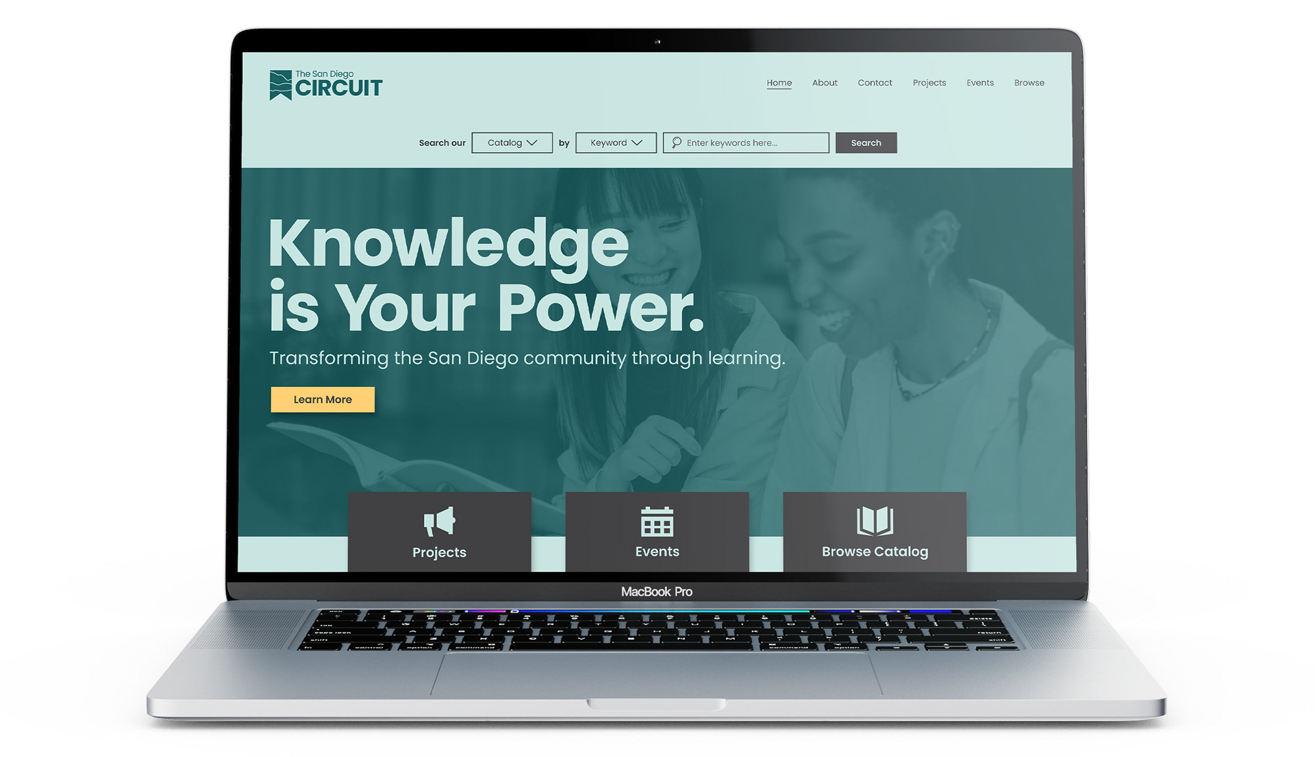
The landing page required a complete revamp from their current website in order to align with their new business goals. I used the slogan once again to catch the viewers eye, and draw them to the "learn more" button, which would direct them to the company's projects. I kept the catalog search bar at the top to keep it easy to find, as it is still an essential service. At the bottom, I incorporated tabs to direct viewers to other important pages. The background image informs the viewer of Circuit's welcoming and educational tone.