Overview
Open Studio is an event held every year at SDSU's School of Art and Design. This public event is a great opportunity for guests to explore the campus and interact with members of SDSU while participating students show off their work.
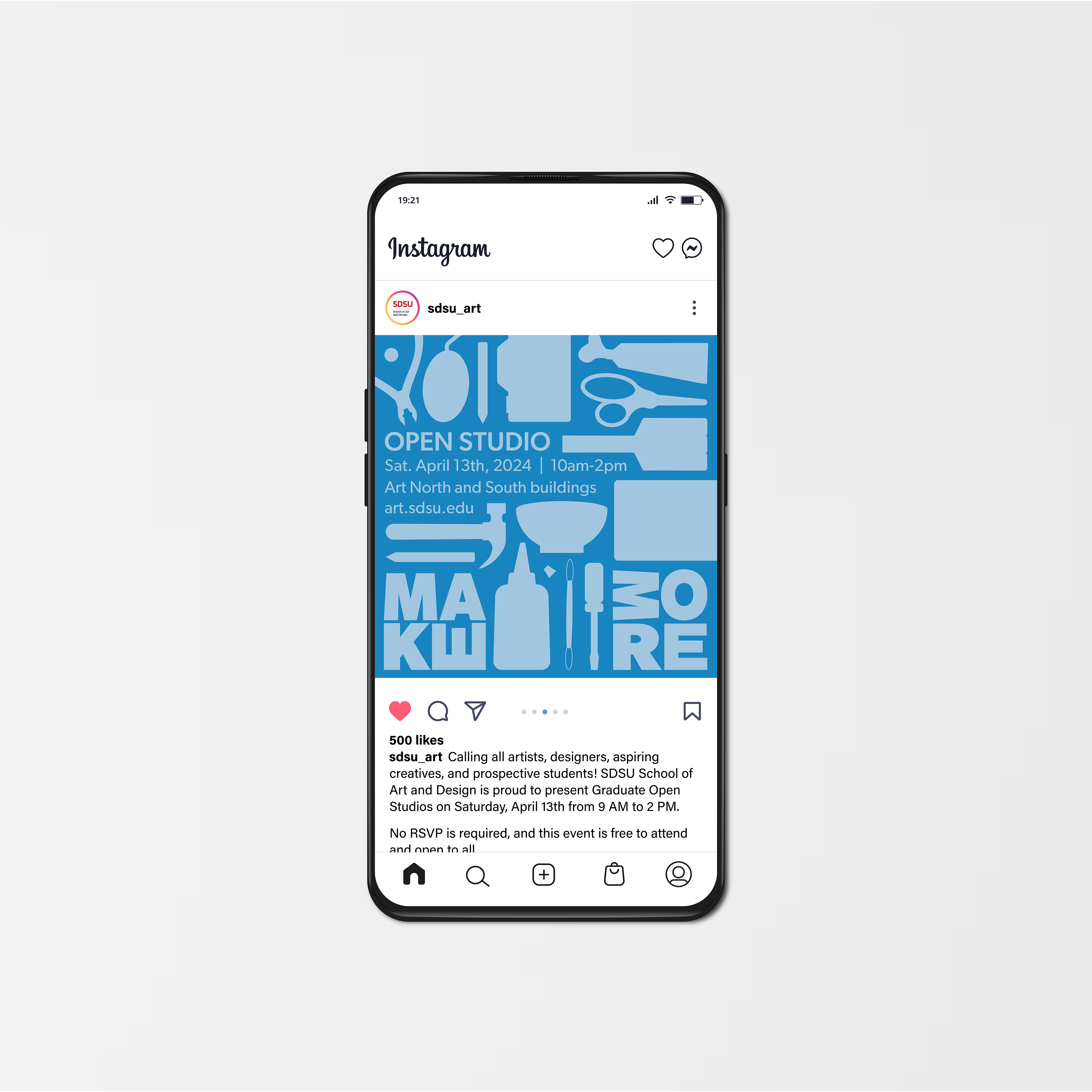
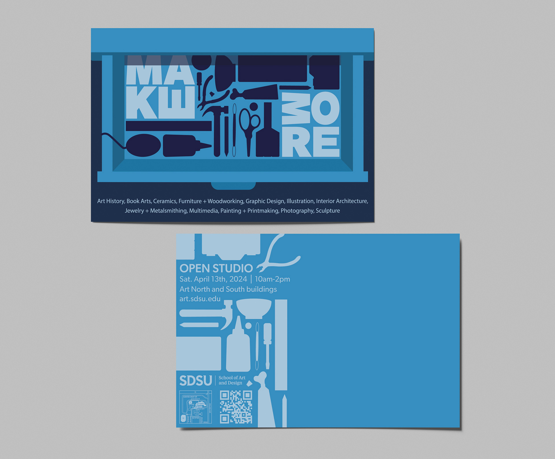
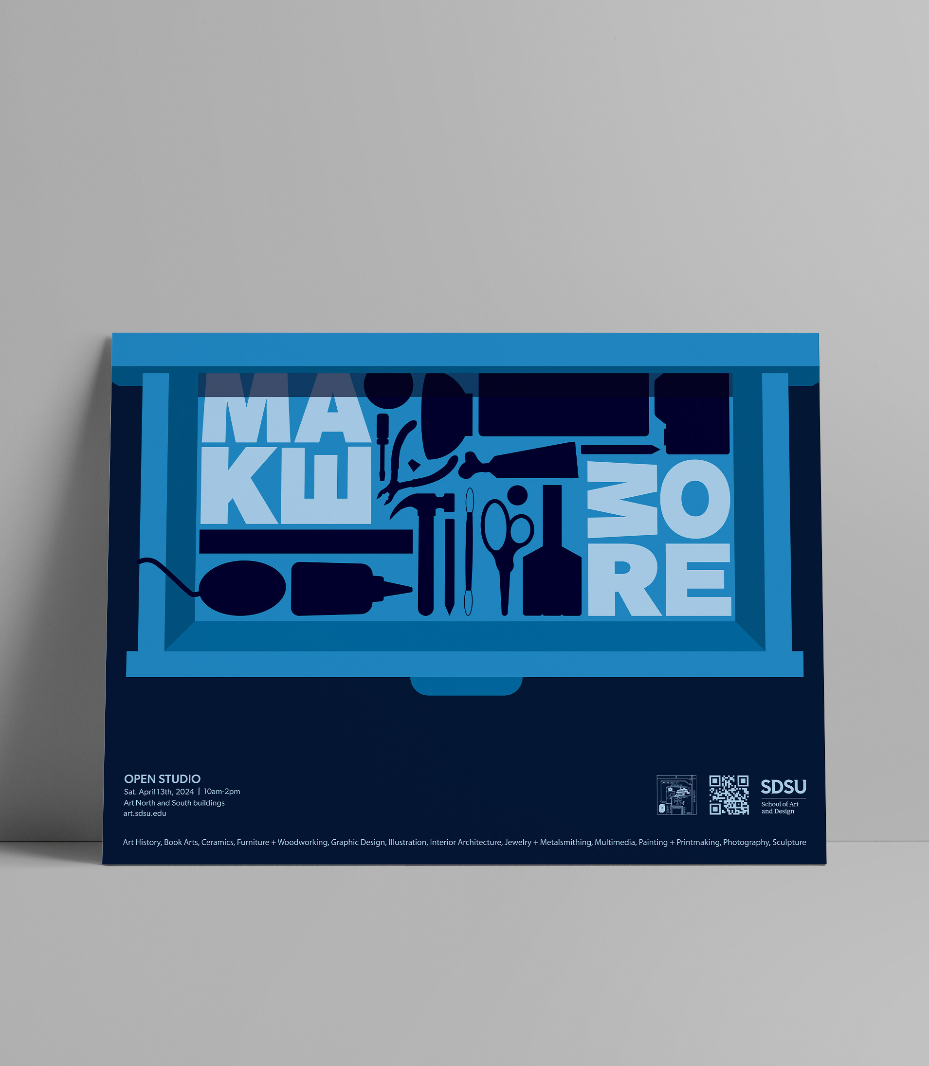
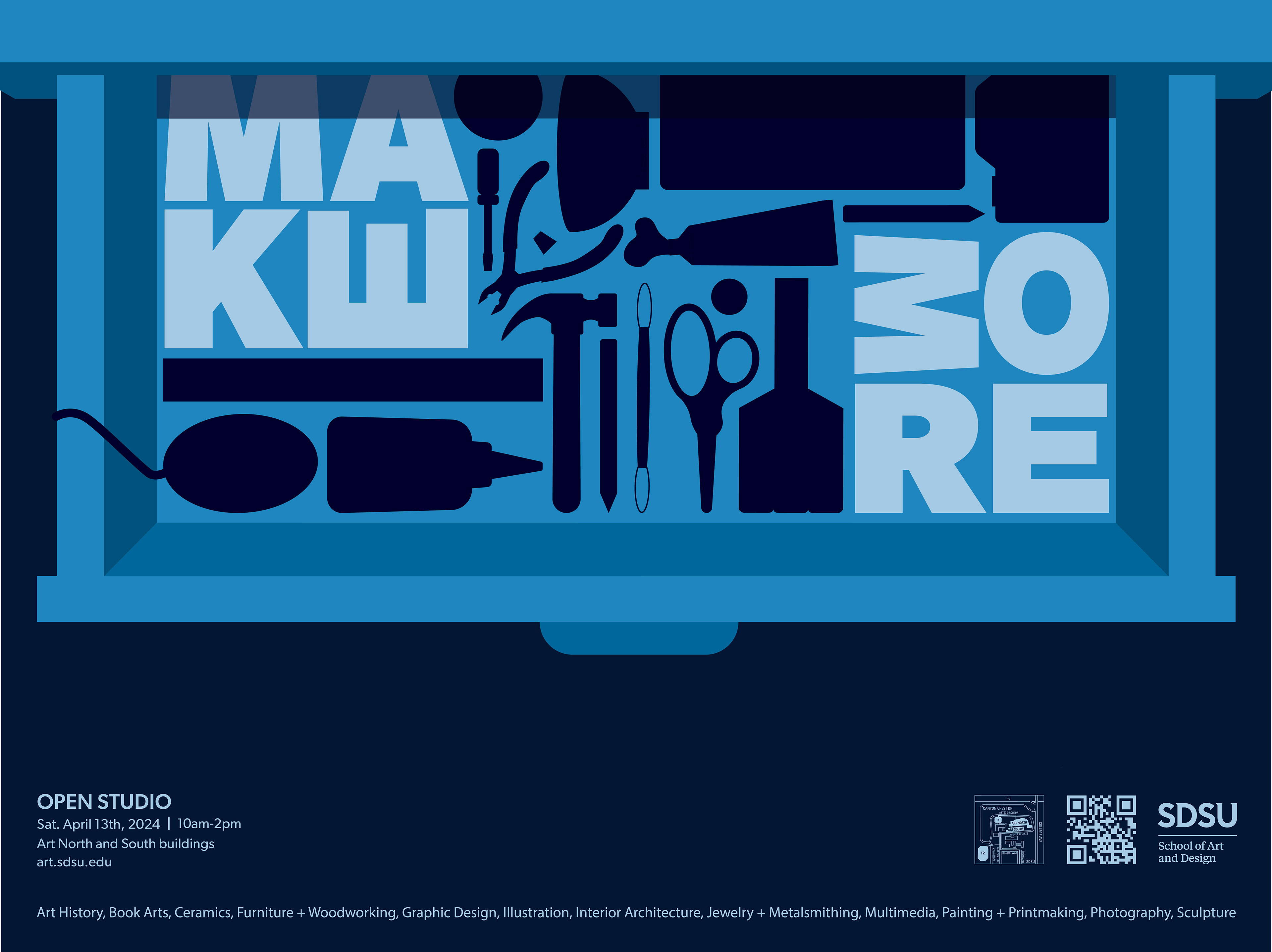
Our Studio Design class was responsible for creating a promotional poster that would appeal to students, faculty, and guests. It needed to represent each department in the School of Art and Design and provide details of the event. We were also responsible for creating collateral which included a postcard and social media post.
My Approach
With the need to represent all twelve departments, I used a straightforward approach. I involved tools used in each department, and placed them all in a drawer. The drawer represents not just where we store our tools, but also our mind and where we store our creative ideas.
I used the saying “make more” because as artists, we are always creating. It is encouragement to continue to “fill up” your drawer with creative experience and knowledge.
Sketches & Inspiration
During the sketching process, I played around with perspective, and ended up going with a birds-eye-view.
I was inspired by posters with a lot of elements that were strategically placed so they fit together nicely. I decided to do something similar considering all of the elements I needed to include.

Concept Development
Throughout the creation process, I played around a lot with placement and color. Initially, I used a 'messier' concept, but gravitated back to an organized one similar to my inspiration.
I decided to remove the detail from the objects and leave only their silhouettes. This made the design more cohesive, and also incentivized the viewer to stop and look to identify what the shapes are.

Color & Type
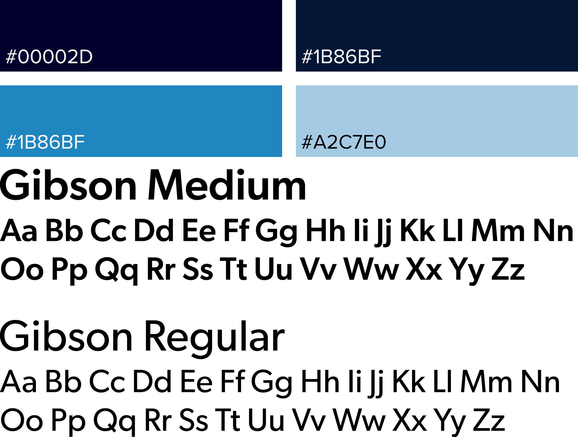
Due to the variety of different elements, I used a monochromatic blue color palette in order to keep the design cohesive.
As for the type, I used Gibson for its geometric style. This made it easy to stack and fit the letters with the other elements.
Collateral
When making the postcard, I kept the front the same as the poster. For the back I rearranged the different shapes to fit around the other elements. I then used the same approach for the social media post as I did with the postcard.