Overview
For this project, I was tasked with creating a brand system for chocolate bars. The target audience were households with dual income and no kids (DINK), as they would be more willing to spend money on new and interesting products. The branding needed to reflect the culture where the cacao was sourced from. It also needed to convey that the brand uses organic, sustainable, and fair trade practices. Lastly, the packaging needed to catch the eye of the viewer to make them want to pick it up.
My Approach
The location I chose to base my chocolate bars on was the Dominican Republic, which is located in the Caribbean. It produces 70% of the worlds organic cocoa despite only producing 2% of the worlds cocoa overall. The Dominican's strong appreciation for their land and their community has aided them in advocating for more sustainable cocoa practices.
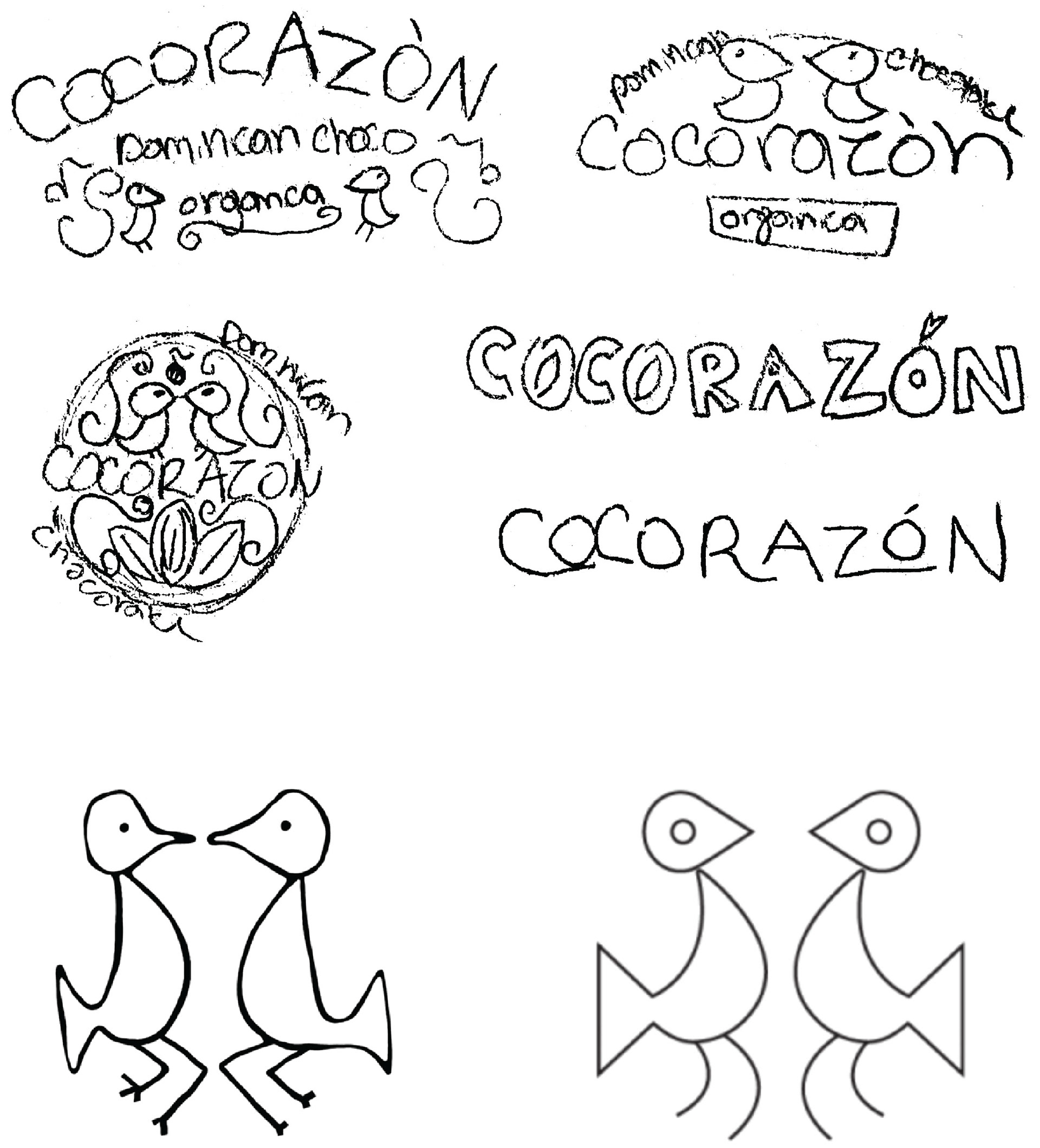
As I researched the D.R. I came across a symbol originating from the Taino culture. The Taino are the indigenous people from the Caribbean. The symbol is known as Eternal Lovers, it is of two birds facing each other and dancing. I felt this was fitting as Dominicans are known for their love of dance and music, as well as for their friendly and familial attitudes.
Logo Sketches & Inspiration
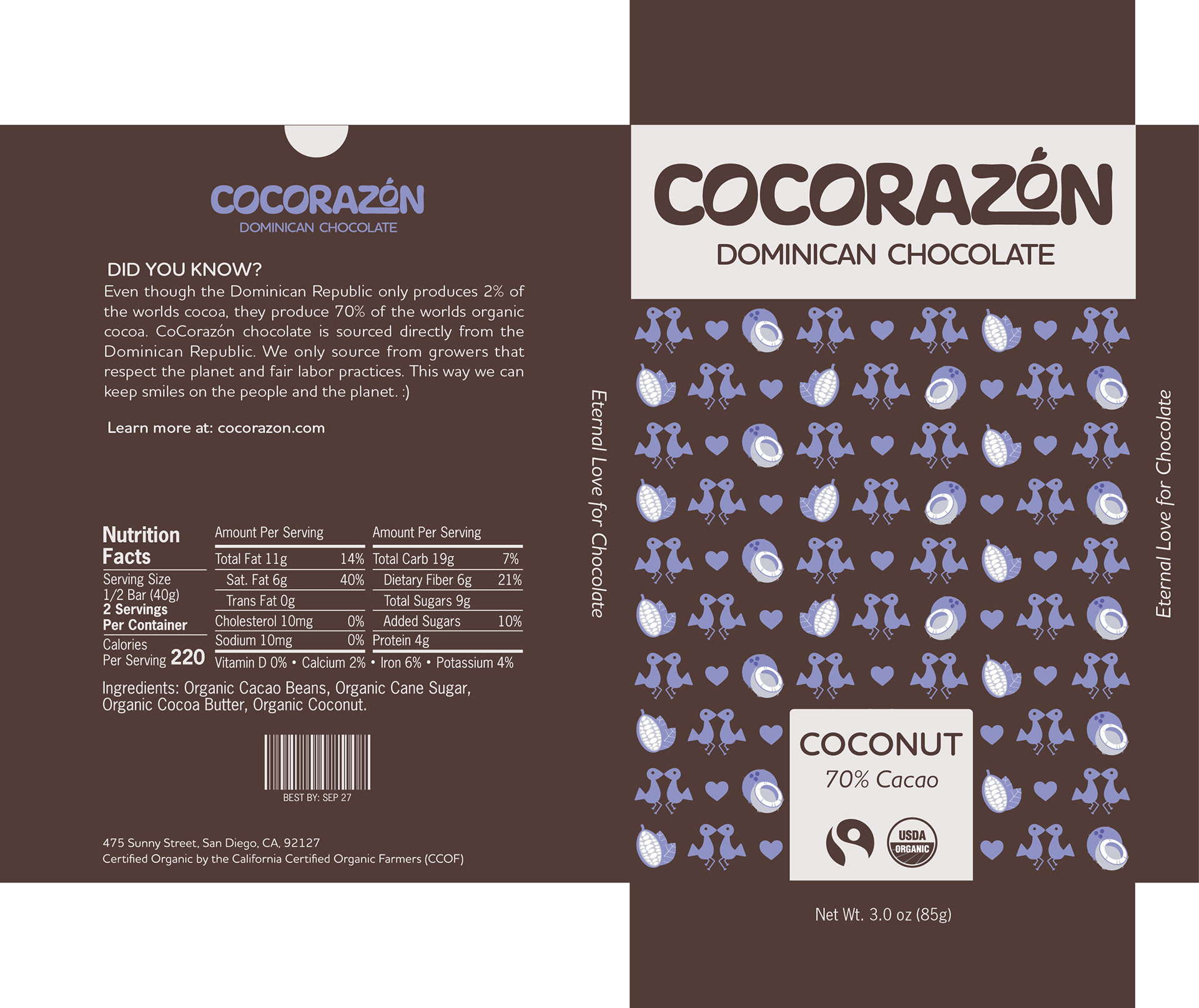
As I was exploring names, I came up with CoCorazón. the "CoCo" represents chocolate. The "Corazón" translates to "heart" in Spanish. This calls back to the Dominican people's love for dance, family, friends, and sustainable cocoa practices.
I later decided to use the Eternal Lovers symbol in my pattern rather than in my logo to simplify it.
Final Logo Concept
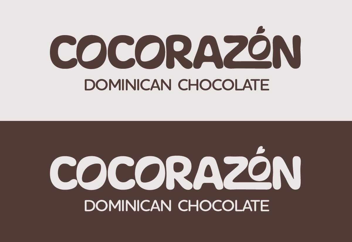
I ended up combining two logo ideas in my sketches. In the counters of the 'O's, I changed them to be shaped like a cacao bean. I used this as well as the modification to the 'Z' to create movement. Additionally, I turned the accent over the last 'O' into a heart.
Color, Type, & Pattern
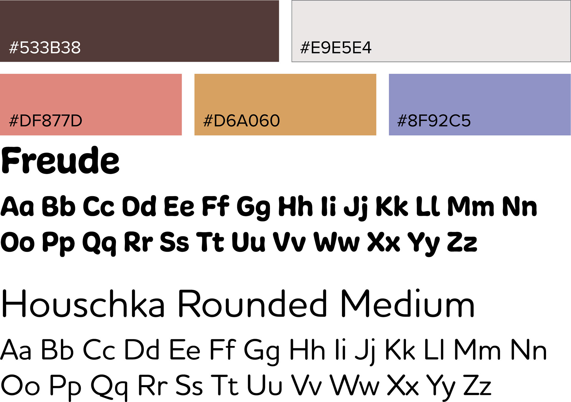
For the primary colors, I used a dark, chocolate-like brown and an off-white. As for the secondary colors, I used a brighter palette that would grab the attention of the consumer, yet still achieve a natural feel.
For the primary type, I used Freude for its rounded and organic characteristics. I paired it with Houschka Rounded as it is approachable and neat.
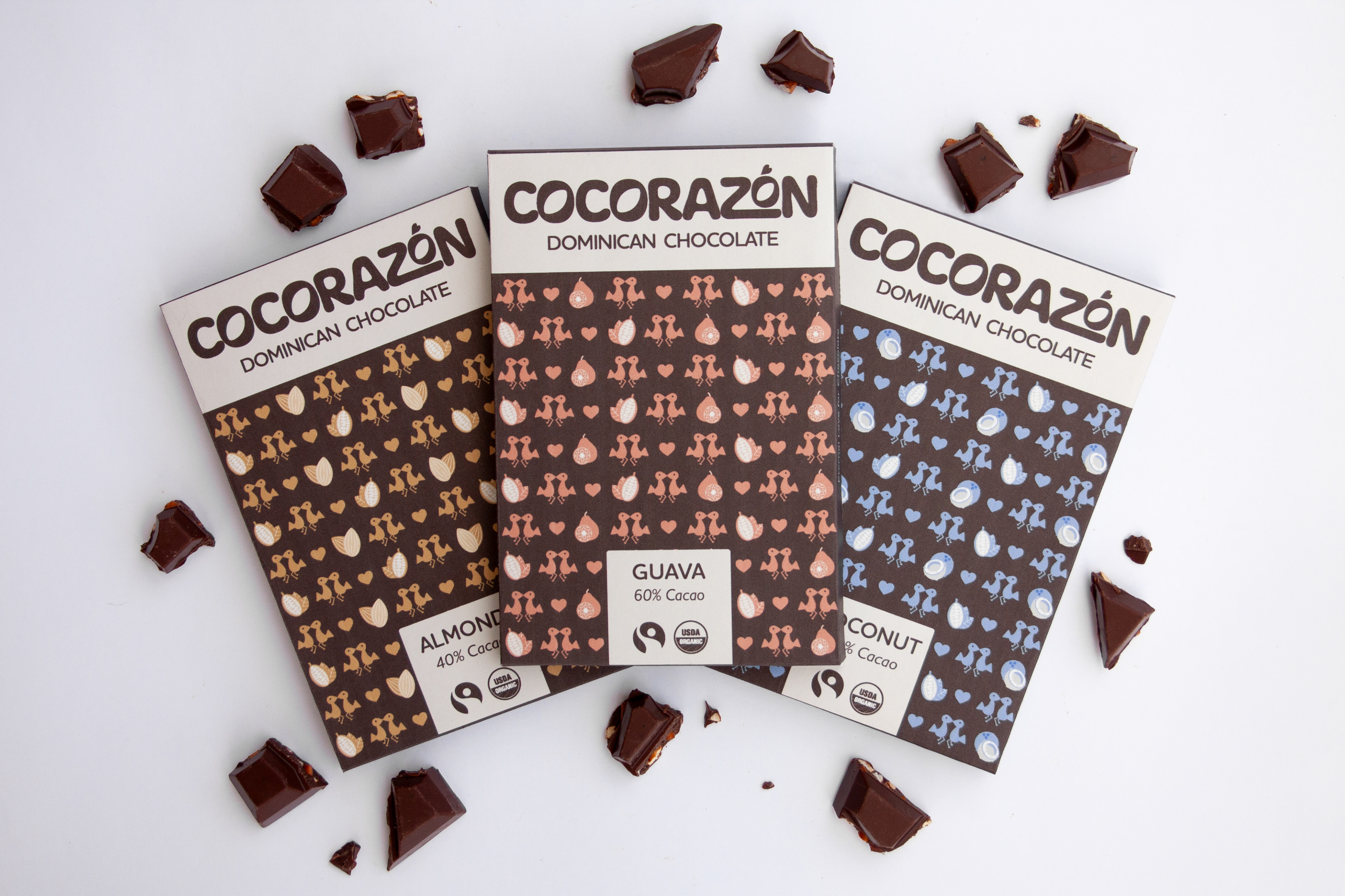
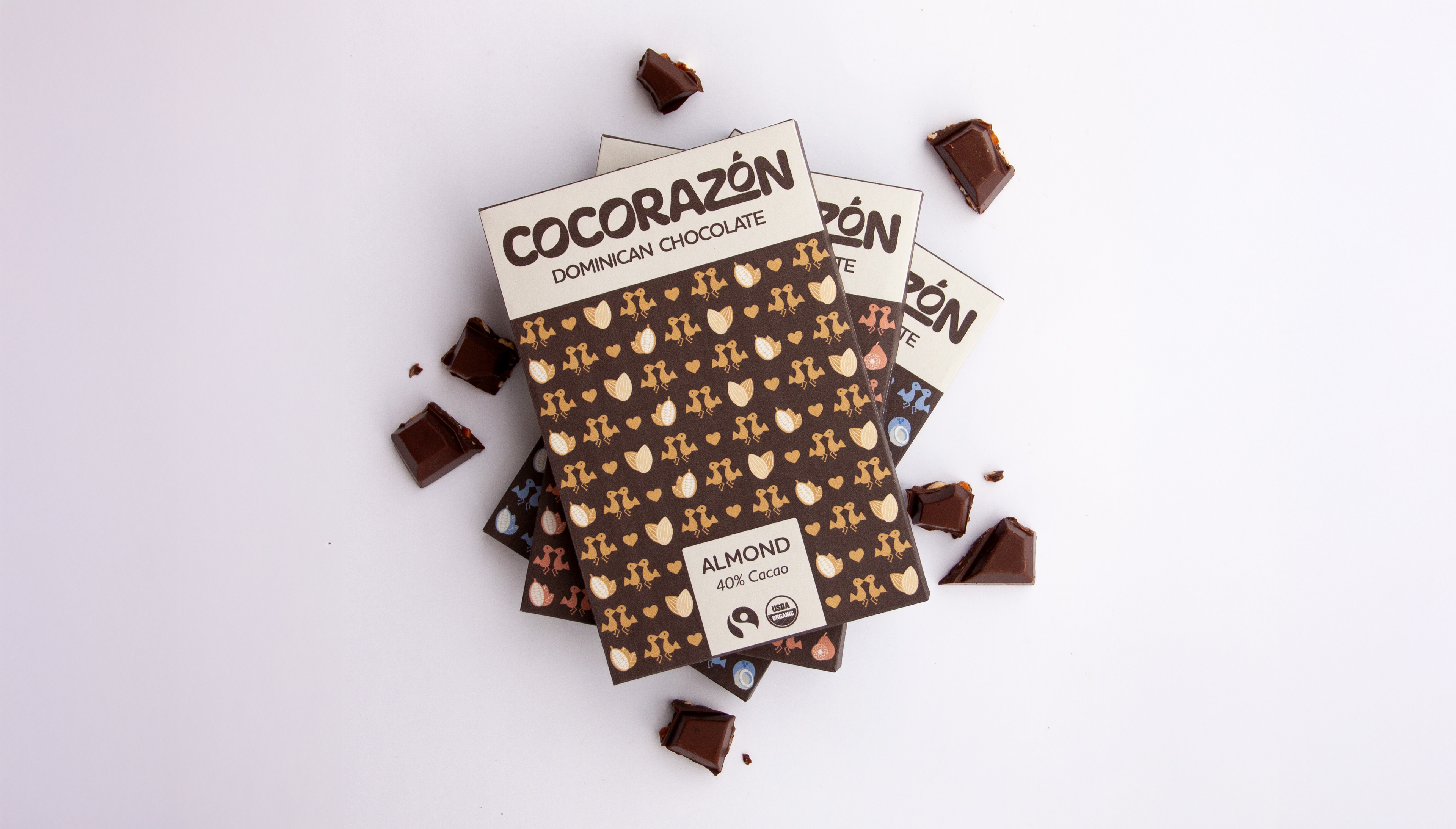
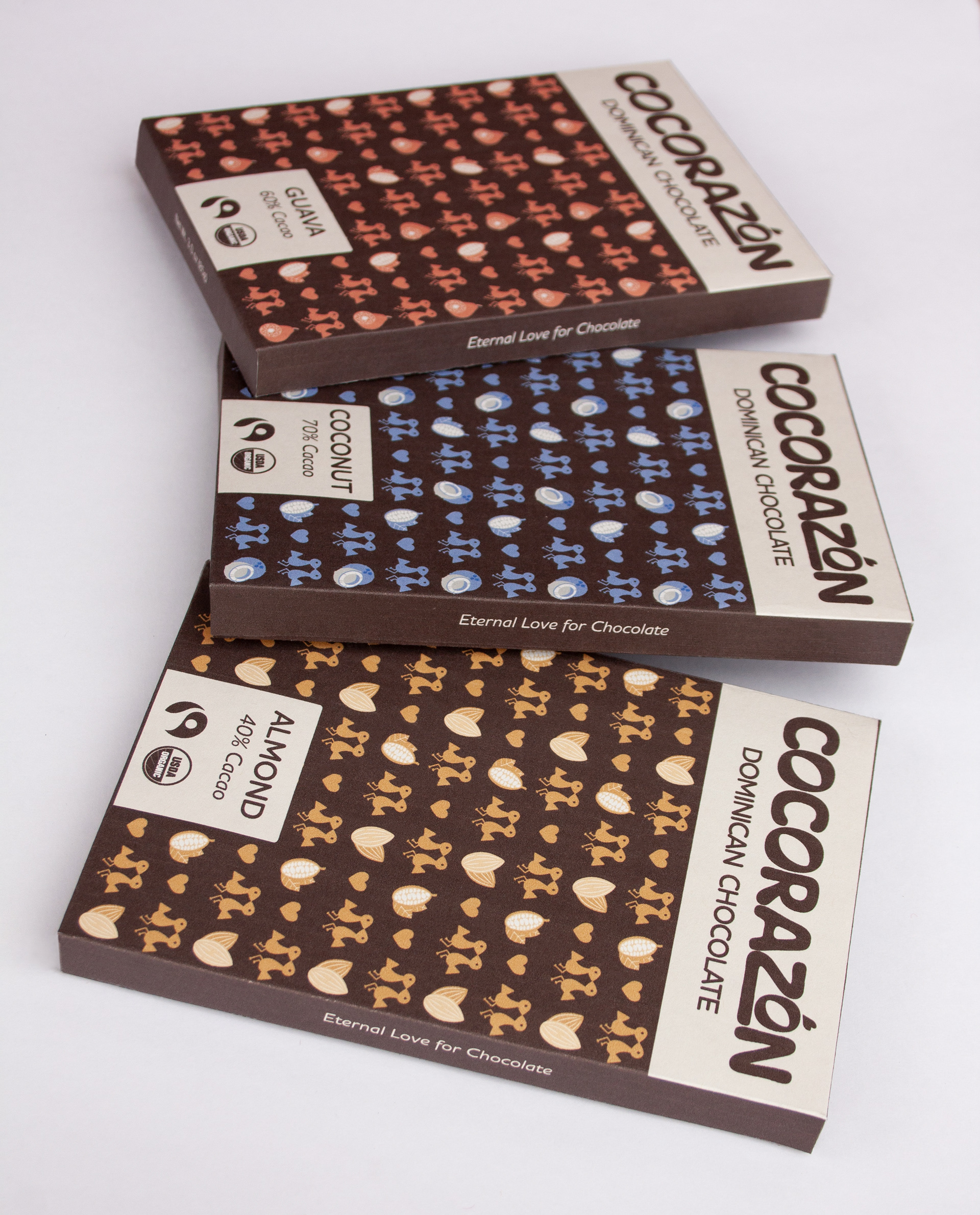
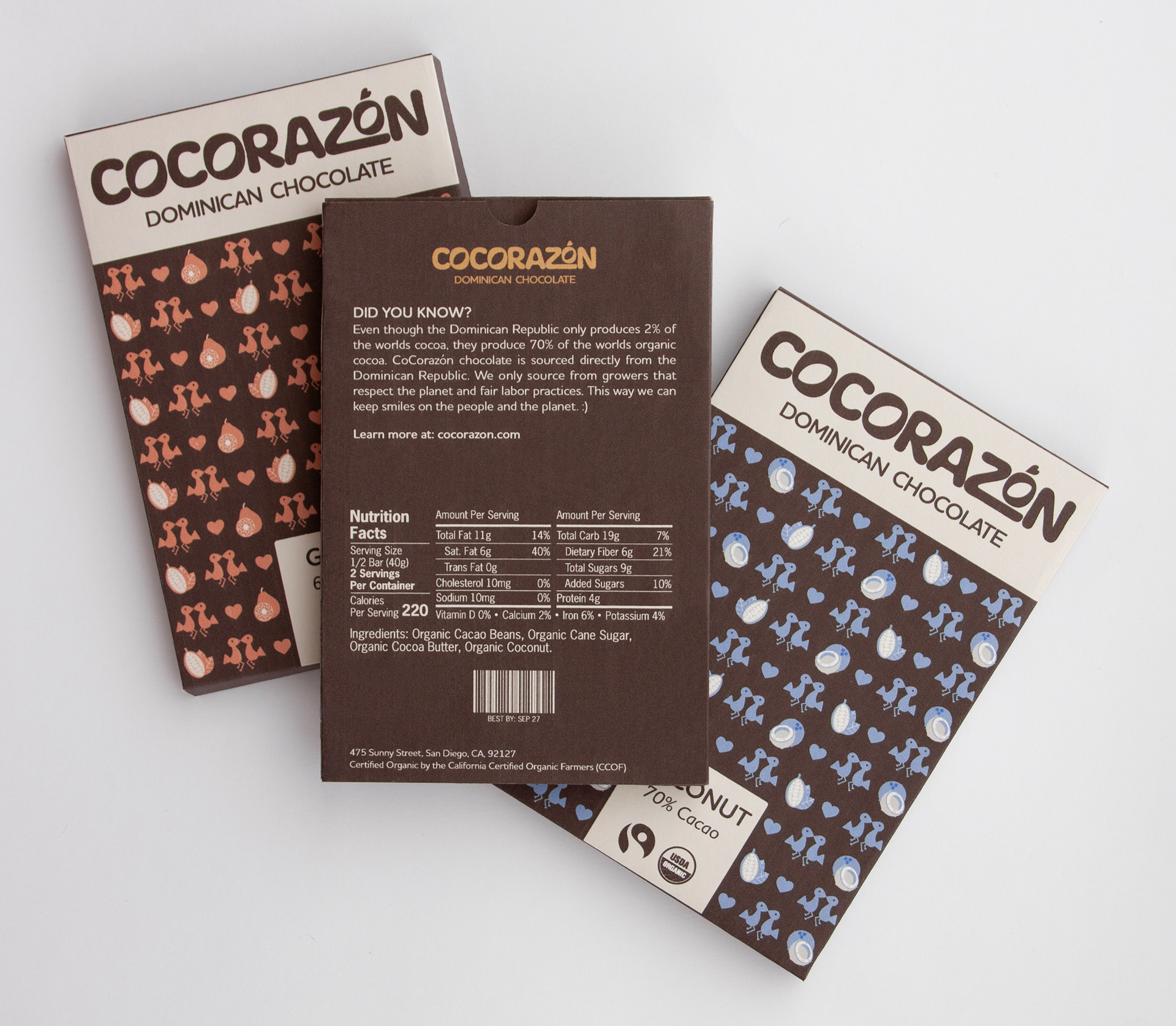
For the pattern I incorporated the Eternal Lovers symbol, hearts, cacao beans, and the flavor of the chocolate bar (coconut, guava, and almond). To achieve movement and emulate dancing, I flipped the direction of each column.

Packaging
I used the pattern on the front of the packaging to catch the eye of the consumer. I placed the logo and other important information in front of the off-white color to keep it easy to read. On the back, I included a short description about the chocolate. I also incorporated a thumb tab to make the package easier to open. On the sides I printed the phrase "Eternal Love for Chocolate" as a call back to the Eternal Lovers symbol.